|
|
Post by reTrEaD on Mar 10, 2012 12:14:37 GMT -5
I realize a "suggestion" should offer a solution, but I don't really have one in this case. Sorry about that. But I think this topic deserves some serious discussion. Whenever someone posts a WIDE image, it messes up the display of ALL posts. Not only on the thread it was posted in, but also in any search that includes that post. For instance, the "View the 15 most recent posts of this forum" link that we all know and love. guitarnuts2.proboards.com/index.cgi?action=recentThis results in the text being spread wider than the page width that most monitors can display. So we have to SCROLL left-to-right to read each line of text. This is a SEVERE and UNREASONABLE nuisance. I fully realize that there are occasions when resizing an image results in loss of detail. But this is no excuse for posting images that wreak havoc with the rest of the forum. If an image must be that wide, a "thumbnail" should be posted, with a link to the full-sized image. The "thumbnail" could even be 600~700 px wide. Just so it doesn't blow out the margins. Unfortunately, users are either unaware or won't bother to be considerate of others in this regard. So what can be done about this? Is there a way of FORCING the images to automatically be displayed in a narrower format? Should we sanction users who post these wide images? I don't know what the answer is. Sometimes, moderators do edit the offending posts, adding height and width specs to the ![]() tag(s). But this required mod intervention and doesn't always happen. And unless or until the edits occur, it make the thread display look like s**t! Does anyone have ideas about how to fix this recurring and annoying problem? |
|
|
|
Post by cynical1 on Mar 10, 2012 12:40:55 GMT -5
We've already got this one covered under Image Posting under post #3. Usually I go in an Modify the ones in the sub-forums I have rights to. The other Admins and Moderators generally do the same. Every once in a while we miss one. Happy Trails Cynical One |
|
|
|
Post by newey on Mar 10, 2012 14:51:01 GMT -5
Yeah, sg and I will redo all the ones we catch. I usually invite the poster to redo it to his preference -thumbnail link, resize, whatever. If they don't comply within a day or two, then I'll modify it.
sg tends to just jump in and modify it, which is fine, too- so long as it gets done.
If we miss any, I'd suggest posting a friendly admonishment to the poster, and then dropping one of the admins or moderators a PM.
sg and I are the only two admins who are still active these days; we can modify any post. Global moderators also have the universal powers, currently, that's JohnH and Runewalker.
Moderators can only modify posts in the sub-boards they moderate.
We are also limited in that only the founder of the board, the original administrator, can elevate people to staff privileges. That's RandomHero, who hasn't shown his face in a few years now.
|
|
|
|
Post by JohnH on Mar 10, 2012 15:38:28 GMT -5
Yes, this is a good thing to discuss a bit more and work out some further guidelines. I am occasionally a deliberate offender myself, for which I would request forgiveness rather than permission. There's never a good reason to dump a 12 mega-pixel snap of your latest project into a forum post, but what width is a suitable limit these days? the point at which the ProBoards view stops being able to compensate and starts having a horizontal scroll bar will depend on the viewers screen resolution and browser settings. Some of my diagrams need a fairly high res to be read clearly, and push the limits. So, could I ask for your opinions on this following example, which was taken as a screen shot for a reply to cynical1 yesterday about treble bleed: The image I posted was 1091 pixels wide: 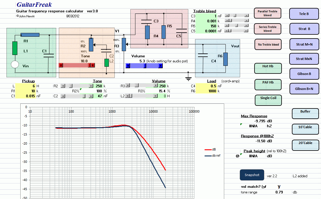 I think that is certainly at or a bit over the limit. I could have gone a bit smaller if needed, but not too much. Who, in reading this post, is looking at horizontal scroll bars because of this picture? My screen, fairly average these days, is 1280 pixels wide. How many people rely on fewer than that? Here is a reduced version of how the post yesterday appears on my screen: 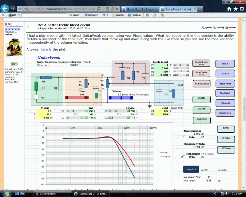 I'm not getting the horizontal bar, but it is struggling and it has crunched up the sides to make space, which I think is OK once in a while. So my personal rule of thumb is to use 800 wide generally where the image is OK with that, and to push to 1000 for things with a lot of detail, and to break my own rule slightly once on a while! I don't think having the web post re-size an image is always good for diagrams with fine lines. Some lines actually can disappear. Its much better to create the image at the final res. Comments? cheers John |
|
|
|
Post by cynical1 on Mar 10, 2012 16:20:31 GMT -5
I try and keep my images to 800 wide. You could probably punch to 1000 and not effect too many people. Anything drawings under 800, unless it's a module, are a waste of time to post, as you say, because the detail blurs into obscurity.
Using the image as a thumbnail is cool for larger images that require a full size rendition to catch all of the pertinent details.
I happens here from time to time, but for the most part it polices itself pretty well. The "Image Posting" thread has been up since 2005. It was amended to request no larger then 800 pixel wide images in 2009. I added my bit about resizing from the posting window in 2011.
It's like Spell Check...it only works when you hit the button... Unfortunately, most people with computers have a limited knowledge of how the damn things actually work.
As stated above, let the poster know, let an admin know and we'll fix it.
Happy Trails
Cynical One
|
|
|
|
Post by reTrEaD on Mar 10, 2012 19:12:22 GMT -5
If we miss any, I'd suggest posting a friendly admonishment to the poster, and then dropping one of the admins or moderators a PM. Here's what I read from that. 1 - Friendly. That's the first word, so it has some extra weight. 2 - Admonishment. It's okay to be slightly pushy about the importance of this, but given the first word, don't be a d!ck about it. 3 - PM to Moderator: a - assists the moderator in identifying images that need to be fixed. B - allows the moderators an opportunity to recognize repeat offenders. They can be as pushy as they see fit, if it's a repetitive problem, and do so behind the scenes where admonishment can be stronger without public embarrassment. 4 - (me reading between the lines) Be a little lighter on first offenses, especially by members who have few posts. We don't want to scare off a newbie because he made an error. Yes, this is a good thing to discuss a bit more and work out some further guidelines. Thanks, John. In addition to figuring out the guidelines, I'm hoping we might get lucky and someone who is very net-savvy will come up with a way of fixing the margins to a specific maximum width. I'm probably way too optimistic, but one can hope, can't one? I am occasionally a deliberate offender myself, for which I would request forgiveness rather than permission. The worst of your offenses give me a moderate amount of grief. Annoying, but I wouldn't call it heinous. But some of what I've seen recently is far worse. the point at which the ProBoards view stops being able to compensate and starts having a horizontal scroll bar will depend on the viewers screen resolution and browser settings. Yes! My screen, fairly average these days, is 1280 pixels wide. How many people rely on fewer than that? I do, but perhaps I'm the only one. The monitor on this computer isn't an antique. It's an lcd flat-screen. But the native resolution is 1024 px wide. Although I could change the resolution, I'd have to do so for all users. Since this computer is used by several people (some who have failing eyesight) I'd never hear the end of that. So, could I ask for your opinions on this following example, which was taken as a screen shot for a reply to cynical1 yesterday about treble bleed: The image I posted was 1091 pixels wide: John, I'll edit in some screenshots later, but the bottom line is this: - I don't use a sidebar in Firefox. That leaves the full width available to me, although other users might experience worse limitations if they use a sidebar. - All threads have a scrollbar on the right. That eats up about 20px. - That leaves about 1000px left from my 1024 for everything, including member data on the left. - It's still annoying to scroll to the right, but less heinous if all the text can be read in one position. Not being able to see the originator of the post at the same time, is less than ideal, but still somewhat tolerable. - Ill get you specifics later, but I think 800px is max for no horizontal scrolling (in my case) and 1000px would require just one scroll to the right to be able to read all post text, without being able to see who posted it. BTW, here is your 1091px wide image, resized to 800px wide, with an embedded link to the full width image. Click on the image to see full sized version.  [url=/albums/ww316/JohnDHewitt/GN2/PBasstb.gif][img width=800 height=496 src="http://i731.photobucket.com/albums/ww316/JohnDHewitt/GN2/PBasstb.gif"][/url]Back soon with screenies.  ****************************************** Hi John, Here are the screenshots (resized to 800px) of what I see when I view your thread. Without scrolling:  Scrolled to the right: Scrolled to the right:  Scrolled so that the left edge of the post text is on the left of my screen: Scrolled so that the left edge of the post text is on the left of my screen: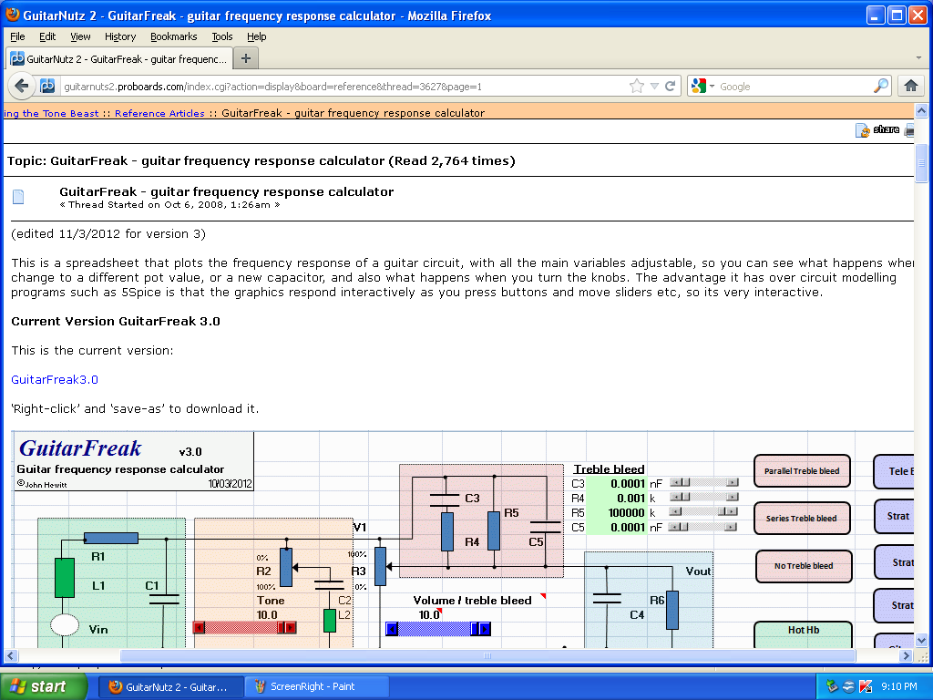  I edited a post I had on another thread to determine what happens with images of varying widths. 700px - NORMAL 720px - Member data area just begins to squeeze. 800px - Member data area is fully squeezed, borders still intact. 820px - Borders have begun widening. 880px - Borders are at the edges of my screen. No horiz scrollbar. 900px - Borders past the edge of screen. Horiz scrollbar present. 980px - Text area of post fills screen when scrolled to the right. 1000px and up - Horizontal scrolling required to read text area. A page like this is moderately annoying for me to view: guitarnuts2.proboards.com/index.cgi?board=music&action=display&thread=6222&page=1A page like this is a complete disaster for me: guitarnuts2.proboards.com/index.cgi?action=display&board=wiring&thread=6169&page=4 |
|
|
|
Post by newey on Mar 10, 2012 21:36:13 GMT -5
RT-
Your points 1-4 above echo my thoughts exactly.
|
|
|
|
Post by cynical1 on Mar 10, 2012 21:41:04 GMT -5
What newey said.
HTC1
|
|
|
|
Post by reTrEaD on Mar 11, 2012 2:00:57 GMT -5
I updated reply #5 to be specific about how different widths affect my viewing. This seems very disconcerting: We are also limited in that only the founder of the board, the original administrator, can elevate people to staff privileges. That's RandomHero, who hasn't shown his face in a few years now. I checked his profile. Just over 2 years since he last logged on. This could eventually become a problem. I have a suggestion about this, but I'll send it to you and sumgai via PM.  |
|
|
|
Post by sumgai on Mar 11, 2012 4:41:50 GMT -5
All, Proboards' tools for the Admin are quite powerful, but sadly, we're missing any kind of control over the maximum width of an image. newey and I continue to watch the support forums every so often, in the hopes that enough other Admins will finally tip the balance and force ProBoards to wake up, but so far, it's been a lonely wait......  Sorry for the chagrin. sumgai |
|
|
|
Post by 4real on Mar 15, 2012 4:08:52 GMT -5
I am not sure how one does or can do this, but a lot of forums, I think pro-board things, have auto resize.
For things that require that detail, there is the option perhaps of providing two images, a smaller one and a link to the photobucket image full size.
I use paint to resize everything, I believe that photobucket can do simple editing.
When it happens to me, on the rare occasion it comes from taking an image directly off the net and the size is not obvious often till posted.
I know that I get a lot of pics sent to me via iphones and such these days and these can be huge...changing world there.
Large images can be a real pain though, not only for the reasons stated, but my ISP has an annoying habit of regularly slowing my speed around the start of the month...to 3.7 kbs would you believe for the last few weeks and coming across a giant image can really screw with things as it attempts to download and then, close down...hmmm
Anyway, perhaps look into the possibility of resizing, I think this might be the case over at PG, not been around for a while, but I have seen this auto resize around the traps, would fix the problem and save a lot of work. Where I have seen it it is framed with the resize and clicking on it opens the full image elsewhere.
don't know if that helps, it is a bugger. At least here those bad sig images are banned, it is such a pain to have a list of everyone's inventory with every post, let alone pics that are often unrelated.
|
|
|
|
Post by sumgai on Mar 15, 2012 11:02:09 GMT -5
Pete, Actually, images in signatures are not banned. We just have a more mature membership roster that's grown past that kind of thing. In fact, we don't even have a policy in place about this, the need has just never arisen. +1 for us! ;D Although I've stored up some doozies, in case I need to prove that I've gone completely off the deep end!  sumgai |
|
|
|
Post by reTrEaD on Mar 15, 2012 11:38:56 GMT -5
|
|
|
|
Post by JFrankParnell on Mar 15, 2012 21:32:54 GMT -5
well, that looks pretty easy. Admins, you have control over this 'global footer'? Web dev is what I do, so let me know if you need help.
|
|
|
|
Post by newey on Mar 15, 2012 22:06:10 GMT -5
sg and I will do a test of this over the next few days, see if it works as advertised.
|
|
|
|
Post by sumgai on Mar 16, 2012 2:02:43 GMT -5
reT,
Well, just when we thought that the ProBoards staff was ignoring us, you come along and find this....
Works like a charm for me! I tested it in this very thread, where John purposely introduced an oversize image, and the script immediately re-wrote the code, as specified. Howzabout anyone else - do you get the "new and improved" page, with no scrolling, or is it the same old, same old for you? (Providing of course that you using a screen resolution lower than 1024px, or that you're 'browsing' within a window that's not maximized.)
'T, I set the "max" numbers to 848 and 636, a touch over the SVGA standard numbers. Is that good for you, or do you want/need something different?
I have not yet tested with an image greater than 636px in height. I don't recall that we've ever had a problem in that regard, so I'm tempted to remove that portion of the code. Opinions?
sumgai
p.s. reTrEaD, I think you're about to find your Karma count acting like a rocket - straight up! ;D
|
|
|
|
Post by newey on Mar 16, 2012 4:48:48 GMT -5
I'm getting it just fine! |
|
|
|
Post by 4real on Mar 16, 2012 7:25:13 GMT -5
Pete, Actually, images in signatures are not banned. We just have a more mature membership roster that's grown past that kind of thing. In fact, we don't even have a policy in place about this, the need has just never arisen. +1 for us! ;D Although I've stored up some doozies, in case I need to prove that I've gone completely off the deep end! sumgai Whoo Hooo... I got over 20,000 pics now and to think I could add it to my sig and they would be seen on every post I had ever made...don't tempt me...oh no, too late, I think I will have a go... EDIT...meh...I'll think about that, it does seem immature like a 4 y r something..hey, that is a 4 yo and me...so fitting! |
|
|
|
Post by reTrEaD on Mar 16, 2012 9:01:30 GMT -5
Actually, images in signatures are not banned. We just have a more mature membership roster that's grown past that kind of thing. Mature in age, maybe. Seriously, I think the use (or absence) of pics and absurdly large amounts of text in sigs, feeds on itself. On boards where this is common, users tend to draw more and more attention to themselves instead of the content of their posts. A high level of self-restraint in sigs gives a clean look to the board that everyone appreciates. So users tend to follow the theme and keep their sigs tight and subtle. Imho, the more subtle the sig, the more impact it has. 'T, I set the "max" numbers to 848 and 636, a touch over the SVGA standard numbers. Is that good for you, or do you want/need something different? I have not yet tested with an image greater than 636px in height. I don't recall that we've ever had a problem in that regard, so I'm tempted to remove that portion of the code. Opinions? The width works great for me. Regarding the height, be careful! If you fully understand ALL of the coding, you could remove that. But you'll have to remove ALL references to that variable. I think the easy way out would be to set the height number to something very large, say 9000. That would make it highly unlikely that an image would ever be reduced because of height. And if the original code was essentially intact, you could easily reduce the height limit, if you ever find a need. |
|
|
|
Post by KIIMH on Mar 16, 2012 10:51:17 GMT -5
|
|
|
|
Post by sumgai on Mar 16, 2012 13:39:59 GMT -5
reTread, What you say above is true. But now that I've been made aware of just how extensive a script can act, when placed into the footer, I can easily eliminate images outright - a virtual ban, if you will. newey and I will cogitate on the need/desirability of this action. No, in fact that would render the script useless - the height variable(s) must remain as a part of the calculation, in order to maintain the same aspect ratio. Ordinarily this is a good idea. I usually don't think of things like this, as I'm from the days of old, where we didn't want to 'send' any more characters across the wire than the bare minimum to get the job done. In today's age, we tend to think of waste as a non-problem. Shame, that... it quickly leads to inelegance, and from there, the idea of bling versus usefulness spirals ever further away from the latter. Again, thanks! ;D sumgai |
|
|
|
Post by JohnH on Mar 16, 2012 14:43:04 GMT -5
Nice work, the 'shrink-o-matic' code seems to do a good job. Images that are just a bit too big seem to be still adequately legible when shrunk, for a quick look. The click to see full size allows a more careful review.
I'd second the idea that the vertical height limit, if specified at all, should be larger - I'd suggest equal to the width. I saw a few squarish images being cut down to meet the height limit, but which could have been left wider. Once the side bars are allowed for, the reamaining screen width is about the same as the total height on a 4x3 screen.
Of course, there are wide screens these days, but they tend to be newer and so will generally have more spare pixels to the side and about the same vertically, so the limits will still work.
John
|
|
|
|
Post by reTrEaD on Mar 16, 2012 17:16:53 GMT -5
No, in fact that would render the script useless - the height variable(s) must remain as a part of the calculation, in order to maintain the same aspect ratio. Sorry. I was terribly ambiguous when I used the phrase "that variable". I didn't mean references to all variables regarding height. Just references to the variable that represents the height limit. There will be some internal comparison being done with regards to the imposed limit and the height of the original image, later in the coding. If that variable is used later in the coding, without being defined, I don't know what might happen. It might be ignored and the rest of the decision tree might remain functional. Or the undefined variable might cause an exit, rendering the other decisions and image manipulation to be aborted. Short story long, might still be okay, might be bad juju. I'd second the idea that the vertical height limit, if specified at all, should be larger - I'd suggest equal to the width. I think the max height could be even larger than the max width. If someone posts a large image that has more of a 'portrait' aspect ratio, there isn't a need to squeeze the width any narrower than what is necessary to maintain normal margins. We will always have to scroll vertically, just to read through a thread. It's the combination of scrolling vertically and horizontally that makes for a real bad day. |
|
|
|
Post by sumgai on Mar 16, 2012 19:51:33 GMT -5
'Tread's right, the height limit can be as large as we wish, making it the same as the width (limit) is not any more ideal than otherwise. Specifically, I can recall some of ChrisK's images that were dreadfully expansive in height, though they were compact in width. Knocking those down by say, 20%, could conceivably compromise the image to the point of illegibility - depending on the user's screen/window dimensions, of course. But now I'm having second thoughts..... My new "take" on this: While it's nice to have an image located right with the text, all in a single window, it's also nice to be able to keep that image in front of us as we scroll through text that's rather lengthy (think of a certain Phillip Islander ) - two windows would make that a snap. I'm thinking that I may look for a way to implement that function, now that I have the clues. sumgai |
|
|
|
Post by cynical1 on Mar 17, 2012 9:58:27 GMT -5
But now I'm having second thoughts..... Do we need these? Are we talking a pop up window, or an open in new browser window...or something else? To me, this falls under the "just because you can..." category. For me, I run Mozilla with NoScript and AdBlock +. This kills most scripts automatically, unless I make an exception... I'm probably in the minority here with these two addons, but most browsers block pop ups by default. Asking users to make browser default option changes is like asking most of them if they want to be Crewman #5 on Star Trek... Running dual monitors can make this feature useable, but I'm not sure how many folks are doing that now. I do it, but I generally have an RDP session or a VM running on the other monitor. Not sure how the feature implements. More data required... Happy Trails Cynical One |
|
|
|
Post by sumgai on Mar 17, 2012 23:52:48 GMT -5
c1, Well, most people/browsers nowadays have, and use, tabs. This makes multiple views quite a bit harder (and is the single biggest reason I don't use them), so I was thinking of adding a line of text just below the image, and it would alert the user that he/she could click the image, which would then open up in a separate viewing session. This could be either a browser window or a separate tab, whichever the user prefers. That image might or might not be larger, but my point is that multi-window conceptualizing of an idea is a good thing, but it should be optional. Does that seem fair, or am I solving a problem that doesn't exist? sumgai |
|
|
|
Post by cynical1 on Mar 18, 2012 0:23:51 GMT -5
Does that seem fair, or am I solving a problem that doesn't exist? Well, having worked contracts for the State of Wisconsin for a few years, I have seen quite a bit of that... I think it'll just cloud the waters and confuse more people then it'll help. I find scrolling easier then jumping between tabs. Just my two cents. Happy Trails Cynical One |
|
|
|
Post by D2o on Mar 18, 2012 9:15:47 GMT -5
I find scrolling easier then jumping between tabs. Ditto for me, fwiw. D2o |
|
|
|
Post by sumgai on Mar 18, 2012 14:14:28 GMT -5
I have a little utility that works as an extension of IE's context menu.... Presume you see some text that represents a URL, but it's not a working link. With this Browser Extension, you highlight that text, right-click it, and select Open In New Window. (I've tested it with IE9, which defaults to using Tabs - you do indeed get another tab, instead of another browser session.) If it happens that you have no text selected, it just opens the current page in a new window. That last bit, I use that constantly.... when I see a diagram that I want to compare against another iteration (perhaps drawn by someone else), I just do as above, and Whoala!, they're side-by-side. Beats scrolling all to Helen Gone! ;D Now imagine that ability when the two items under my microscope are on different pages.... starting to see my point?
What I'm proposing is letting others do the same, nothing more. No Browser Extension needed, it'd be in the coding of the page itself.
And yes, unfortunately for some, it's in javascript. Which means that ad blocking software would have to be advised of whether or not to permit this particular script.
Further comments?
sumgai
|
|
|
|
Post by cynical1 on Mar 18, 2012 15:34:53 GMT -5
As long as it doesn't degrade the functionality we currently have I don't have any issues with it. If it defeats the current process for reviewing a post I'd have to debate the merits of fixing something that isn't broken.
I liked the auto-resize on images. That makes sense and opens the larger image in another tab in Firefox and Chrome. I can live with that.
I like this forum as it doesn't require browser specific plugins, have nonsensical "look what I learned in school" coding built in and it relies entirely on content versus smoke an mirrors...and it has a trick logo...
Again, just my 2 cents.
Happy Trails
Cynical One
PS: Who uses IE anymore?
|
|