|
|
Post by kitwn on Feb 2, 2023 3:56:22 GMT -5
I love the animated frequency response plot! What software do I need to make one of those? It's not so much a piece of software as it is a combination of applying the relevant calculations to a mathematical model of a pickup (usually taken from JohnH's GuitarFreak) and a rough understanding of SVG animations — gluing those two together via a programming language (plus appropriate libraries). A little more specifically: my go-to language is Python, so I'm using Numpy for the maths & Plotly for the graphing. Plotly has the functionality to export (static) SVGs which I use as a basis for the image, then patch that file to include the animation cycling over the results obtained from varying the pertinent parameter. Yogi B, Thanks for the detailed explanation, though I had hoped you'd say it's a version of Spice! I have found out how to create a graph of multiple plots in LTSpice to show how a response changes for changes in a resistor or capacitor value etc. but the animation works really well. Having done some programming and some stop-frame animation in the past I'm definitely up for the move from clay to CG 😀
|
|
|
|
Post by cynical1 on Feb 2, 2023 10:25:54 GMT -5
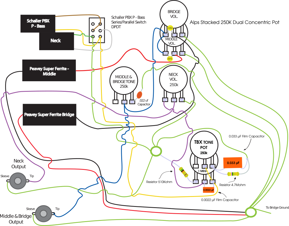
Here, the red trace is the same as the previous purple trace (i.e. no additional resistor), the others proceed decreasing in resistance from 1.2Meg stepping every third E24 value down to 91k. Namely those are 1.2Meg, 910k, 680k, 510k, 390k, 300k, 220k, 160k, 120k & 91k. Wow. That was impressive. I understand the point behind the additional resistor now. For what I want this thing to do, it seems something between 510k and 300k is where I want to go. Thank God there isn't more room in the control cavity...I can see another switch with a few resistors...starting at 91k...but I digress... For myself, and all of us here in EmpericalLand, we thank you. Happy Trails Cynical1 Final drawing below... |
|
|
|
Post by Yogi B on Feb 6, 2023 23:48:15 GMT -5
Thanks for the detailed explanation, though I had hoped you'd say it's a version of Spice! I have found out how to create a graph of multiple plots in LTSpice to show how a response changes for changes in a resistor or capacitor value etc. but the animation works really well. Having done some programming and some stop-frame animation in the past I'm definitely up for the move from clay to CG 😀 I intentionally left the first half of my reply quite open — there's no reason why you couldn't do the number crunching using LTspice, but you'd still need something to extract the resulting data and format it into an SVG file. My Use of Plotly for the latter is ridiculously overkill, but I was already using it to create interactive plots. The idea behind Plotly's rendering engine (Kaleido) is to be as generic as possible — across the multiple available plotting libraries there is no standard way to construct/display the actual graph, except that they'll all work in a web browser. As such Kaleido is a browser (a stripped down version of Chromium). For the very narrow scope of producing only Bode plots over the audio spectrum, it shouldn't be too difficult to program the 'drawing' of the graph with the help of an SVG library.
At some point I'd love to add a custom page to the forum which provided a way to plot, interactively manipulate & export such graphs — but for that, or anything of a similar nature, I'd first need to figure out how to structure a user interface such that it provides the level of flexibility required. (As it stands: I'd say about 50% of my prototype remains controlled by code, with no straightforward solution how to translate it into UI elements.) |
|